Using a different style on phones
On the Trigger tab, the Different style on phones card lets you pick a second style for small screens.
- Choose a style, for example Icon only. Choose None to use the same button on every screen.
- Set Use the phone style up to to the screen width (in pixels) at which the phone style takes over. The default, 768, covers phones and small tablets. You can use 320 to 1920.
- Save.
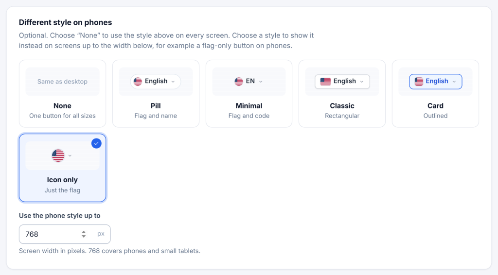
On screens up to that width, visitors see the phone style; on wider screens, the main style. The switch happens instantly when the window is resized or a tablet is turned. Screen readers and keyboard users only ever reach the button that is visible.
The phone style can also be set per menu item (Mobile Style), per shortcode (mobile_style="icon_only") and in PHP ('mobile_style' => 'icon_only'). The width always comes from the Trigger tab.