Changing the colors
Go to Settings → Language Switcher → Colors. The tab has two parts: Pick colors, where you set each color, and CSS & AI (see Theming with CSS or AI). Pick colors has one card per part of the switcher, each with a live preview:
| Card | What it colors | Preview |
|---|---|---|
| Main color | Your brand color: focus outlines, the check mark and the bar on the current language, and the banner button when it has no color of its own. Default #2563eb (blue) |
All previews |
| Switcher button | Background, text and border of the button in your menu, block or shortcode, and the background and border on hover. Empty boxes keep each style’s own look | The 5 button styles, normal and on hover |
| Language window | Window background, text, secondary text, lines and borders, language cards and their hover, the current language (background, border, text), the close button, the search box and the page overlay. Also used by the dropdown and the Language Grid | A small window over a page, with Français in its hover colors |
| Language window in dark mode | The same colors for the dark window (except the current language border and text, which are shared) | The same window in dark |
| Suggestion banner | Background, text, button, button text, and the button on hover | The banner |
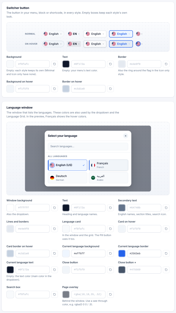
Picking a color. Click the colored square to open your browser’s color picker, or type a value in the box. The previews change as you go; your site changes only when you save. An empty box keeps the default shown in grey and adds nothing to your pages. Click the reset arrow to empty a box.
Dark mode. The dark colors are used when Advanced → Light or dark picker is Dark, or Auto on a visitor’s device set to dark mode. The switcher button itself is not changed by dark mode.
Suggestion banner colors are here too, with all the other colors. The banner’s text, corners and sizes are on the Detection tab.
What you can type:
| Format | Example |
|---|---|
| Hex | #2563eb, #25e, #2563eb80 (with transparency) |
| RGB / HSL | rgb(37 99 235), rgba(37, 99, 235, .8), hsl(221 83% 53%) |
| Modern color spaces | oklch(60% 0.2 260), oklab(…), lch(…), lab(…), color(…) |
| Named colors | royalblue, teal, transparent, currentColor |
| Your theme’s colors | var(--wp--preset--color--primary), var(--primary) |
| Automatic.css | __var__(--primary) (converted to var(--primary)) |
Using your theme’s color variables keeps the switcher in sync when you change your theme’s palette. In block themes, your palette colors are var(--wp--preset--color--<slug>), for example var(--wp--preset--color--accent).
A value the plugin cannot read safely is not saved; the save message tells you it was corrected.