Choosing a button style
Go to Settings → Language Switcher → Trigger. The Button style card shows a live preview of each style. Click one and save.
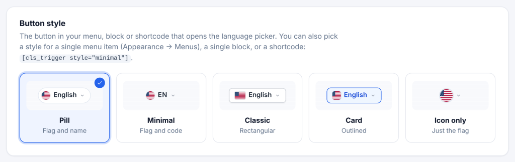
| Style | Shows | Good for |
|---|---|---|
| Pill | Flag and language name in a rounded button | Headers with room to spare; the default |
| Minimal | Flag and short code, for example EN | Tight menus and minimal designs |
| Classic | Flag and name in a rectangular button | Corporate and e-commerce sites |
| Card | Flag and name in an outlined box | Light headers where you want a clear border |
| Icon only | Just the flag | Phones and icon menus |
The button always shows the language of the page the visitor is on.
How the name is written follows Modal → How language names are written: Deutsch (own language), German (English), or Deutsch · German (both).
About the short code (Minimal). It shows the main part of the code: EN, FR, PT. If both a language and its regional version are on (for example English and English (UK)), the regional one shows its full code (EN-GB) so visitors can tell them apart.
Style for one button only. The Trigger tab sets the style for every button. A single menu item, block, shortcode or PHP button can use its own style instead (see Adding the Switcher). The order of priority is: the item’s own style, then the Trigger tab.